Objective
I describe how to use R to perform a principal component analysis on a data frame and how to use the ggplot2 package to plot the loadings on each PC axis with a bar graph.
The Data
This example uses the attitude dataset that comes preloaded with R.
head(attitude)
##   rating complaints privileges learning raises critical advance
## 1     43         51         30       39     61       92      45
## 2     63         64         51       54     63       73      47
## 3     71         70         68       69     76       86      48
## 4     61         63         45       47     54       84      35
## 5     81         78         56       66     71       83      47
## 6     43         55         49       44     54       49      34
PCA and Extracting PC Axes
We could be interested in relationships among the full dataset, or among a subset of variables. In both cases, use the base R function prcomp to perform a principal components analysis on the data. To perform a PCA on all columns in the dataset:
attitude.pca <- prcomp(attitude)
The PC axes can be accessed with attitude.pca$rotation:
PCaxes<-attitude.pca$rotation
PCaxes
##                  PC1         PC2        PC3        PC4         PC5
## rating     0.4467200  0.42184464 -0.2400295  0.1261907 -0.20102006
## complaints 0.5206244  0.37207702 -0.1432265 -0.1081087  0.37237853
## privileges 0.3757726 -0.07632652  0.6513217 -0.6263275 -0.07783612
## learning   0.4209952 -0.14566925  0.1864780  0.4851365 -0.62078169
## raises     0.3762536 -0.23339685 -0.2239163  0.1041004  0.44682483
## critical   0.1300302 -0.39828981 -0.6330345 -0.5170667 -0.37798712
## advance    0.2290738 -0.66592166  0.1095758  0.2579729  0.29490695
##                    PC6        PC7
## rating     -0.47248738  0.5341317
## complaints -0.02200456 -0.6474239
## privileges  0.01814123  0.1734231
## learning    0.30156007 -0.2347416
## raises      0.59329347  0.4374176
## critical   -0.01806699 -0.1147434
## advance    -0.57678447 -0.0765914
Take the object with the principal components and turn it into a data frame. The variable names need to be moved from row names into their own column. I’m also going to add another fake categorical variable to illustrate how to include an additional ‘layer’ of information. The variable will be called category and I’ll assign it a value of positive or negative.
PCaxes<-as.data.frame(PCaxes)
PCaxes$variable<-rownames(PCaxes)
PCaxes$class <- c("positive","negative","positive","positive","positive","negative","positive")
Reshaping the Data
Reshape the data frame so that it’s in long format; each possible variable type (or combination of) has its own row with columns for variables and another for values of those variables. There are a few ways of doing this, including melt in the reshape2 package and gather in the tidyr package. This example uses the latter. See more about melt here and here.
library(tidyr)

df<-tidyr::gather(data=PCaxes,key=axis,value=loading,1:7)
head(df)
##     variable    class axis   loading
## 1     rating positive  PC1 0.4467200
## 2 complaints negative  PC1 0.5206244
## 3 privileges positive  PC1 0.3757726
## 4   learning positive  PC1 0.4209952
## 5     raises positive  PC1 0.3762536
## 6   critical negative  PC1 0.1300302
Plotting
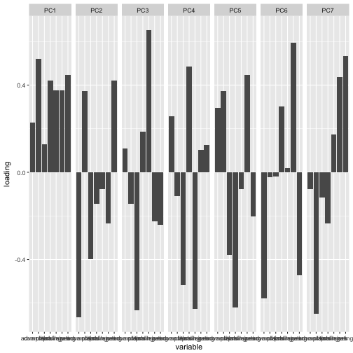
The data is now structured so that plotting is convenient. Each unique combination of variable, class, and PC1 is its own row. Let’s try plotting this information using the package ggplot2. Generally, we want a bar graph that has a separate bar for each PC axis and variable, with the value of the bar representing the loading on that PC axis and variable. In this form, the graph will not present data on the percent variance explained by each axis.
The basic pieces are the data frame (df) and adding a bar plot (via geom_bar()). If you’re unfamiliar with ggplot, terms in aes() are used to define plotting and aesthetic elements based on the data frame. Here, the x-axis presents the factors in variable and the y-axis the numbers in loading. Calling stat="identity", means that the heights of the bars represent values in the data; the default is stat="bin" where the heights represent counts of the number of cases in a group. facet_wrap() adds a panel for each value of the variable specified in the facets term. In this case, we want a unique panel for each PC axis. As you can see, this basically produces the kind of plot that we want.
library(ggplot2)

ggplot(data=df) +
  geom_bar(aes(x=variable,y=loading),stat="identity") +
  facet_wrap(facets=~axis,nrow=1)

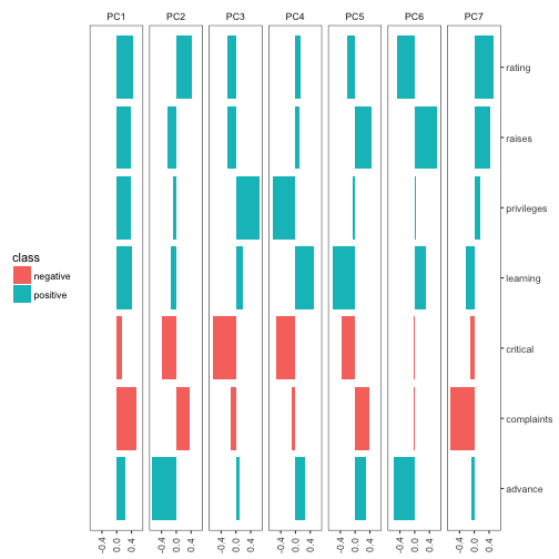
That’s the basic graph but it doesn’t look very nice. There are a lot of aesthetic changes that can be made with the various ggplot2 functions. I give an example of what’s possible below but other modifications are possible.
ggplot(df) +
  geom_bar(aes(x=variable,y=loading,fill=class),stat="identity") +
  scale_x_discrete(position="top") +
  scale_y_continuous(breaks = c(-.4,0,.4)) +
  coord_flip() +
  facet_wrap(~axis,nrow=1) +
  theme_bw()+
  theme(
    strip.background = element_blank(),
    axis.title = element_blank(),
    panel.grid.major = element_blank(),
    panel.grid.minor = element_blank(),
    legend.position = "left",
    axis.text.x = element_text(angle = 90, vjust = .5)
  )
